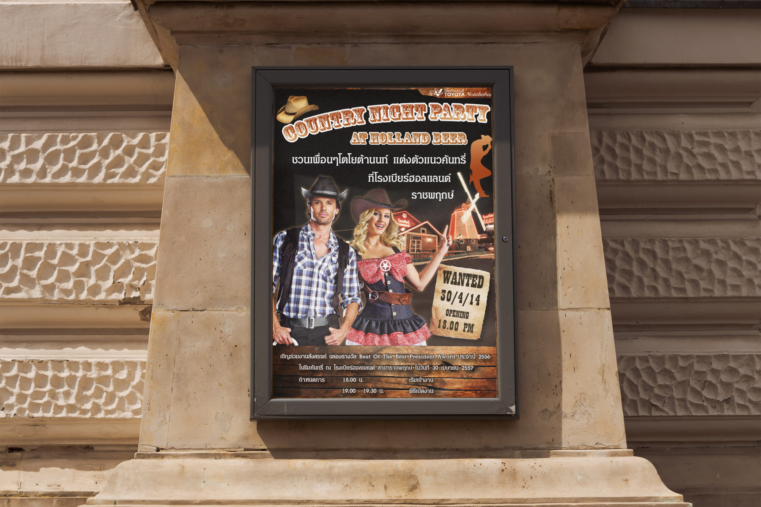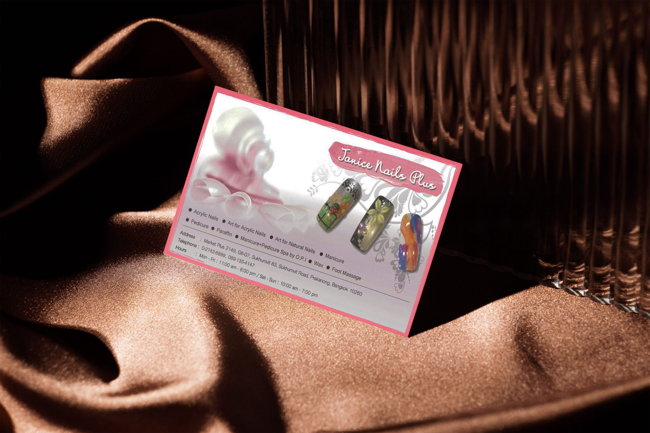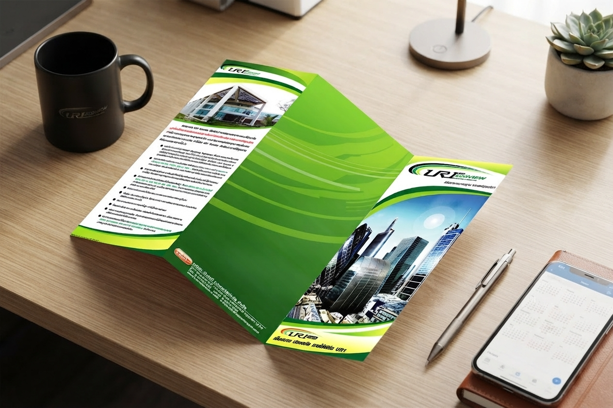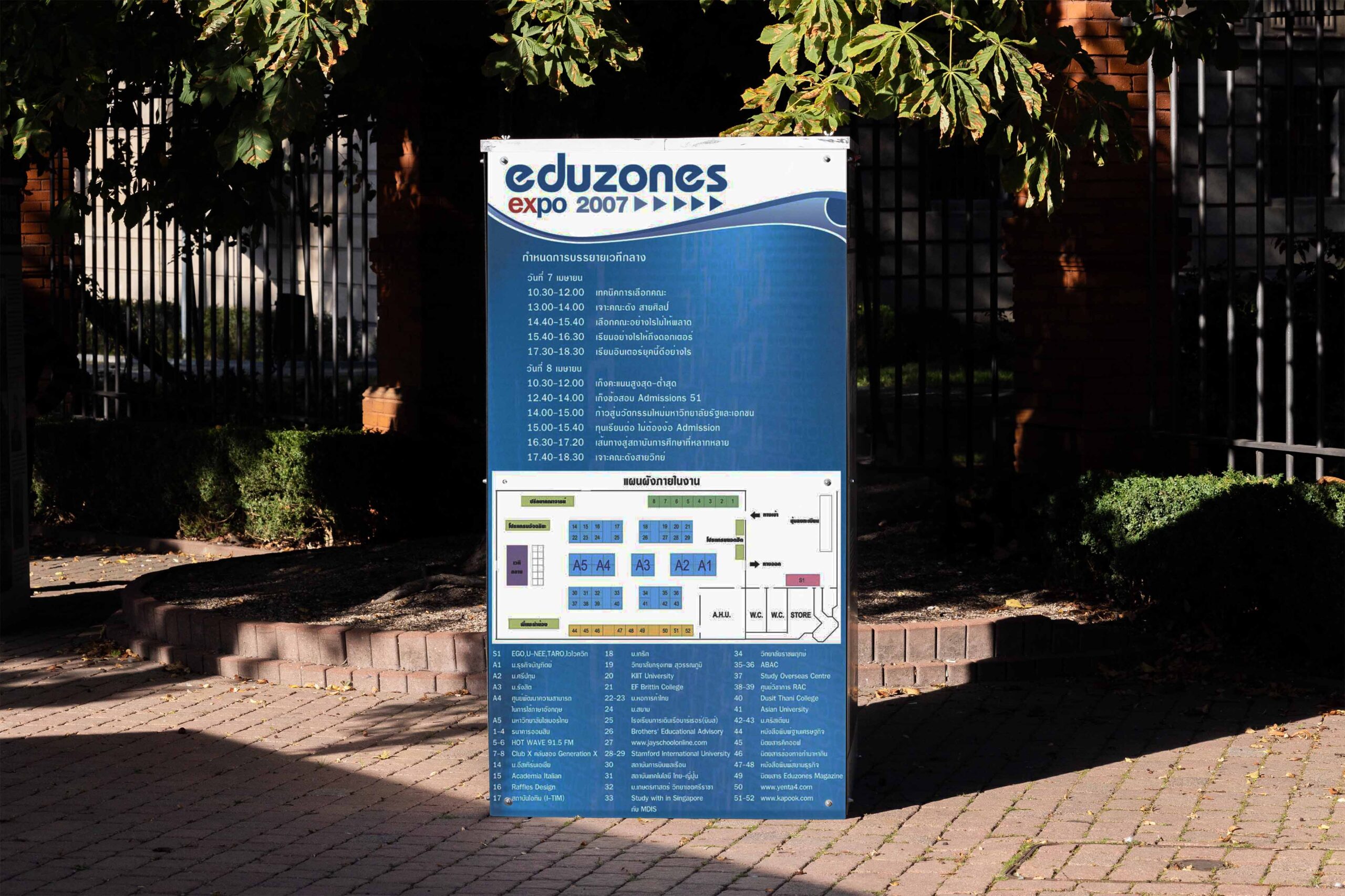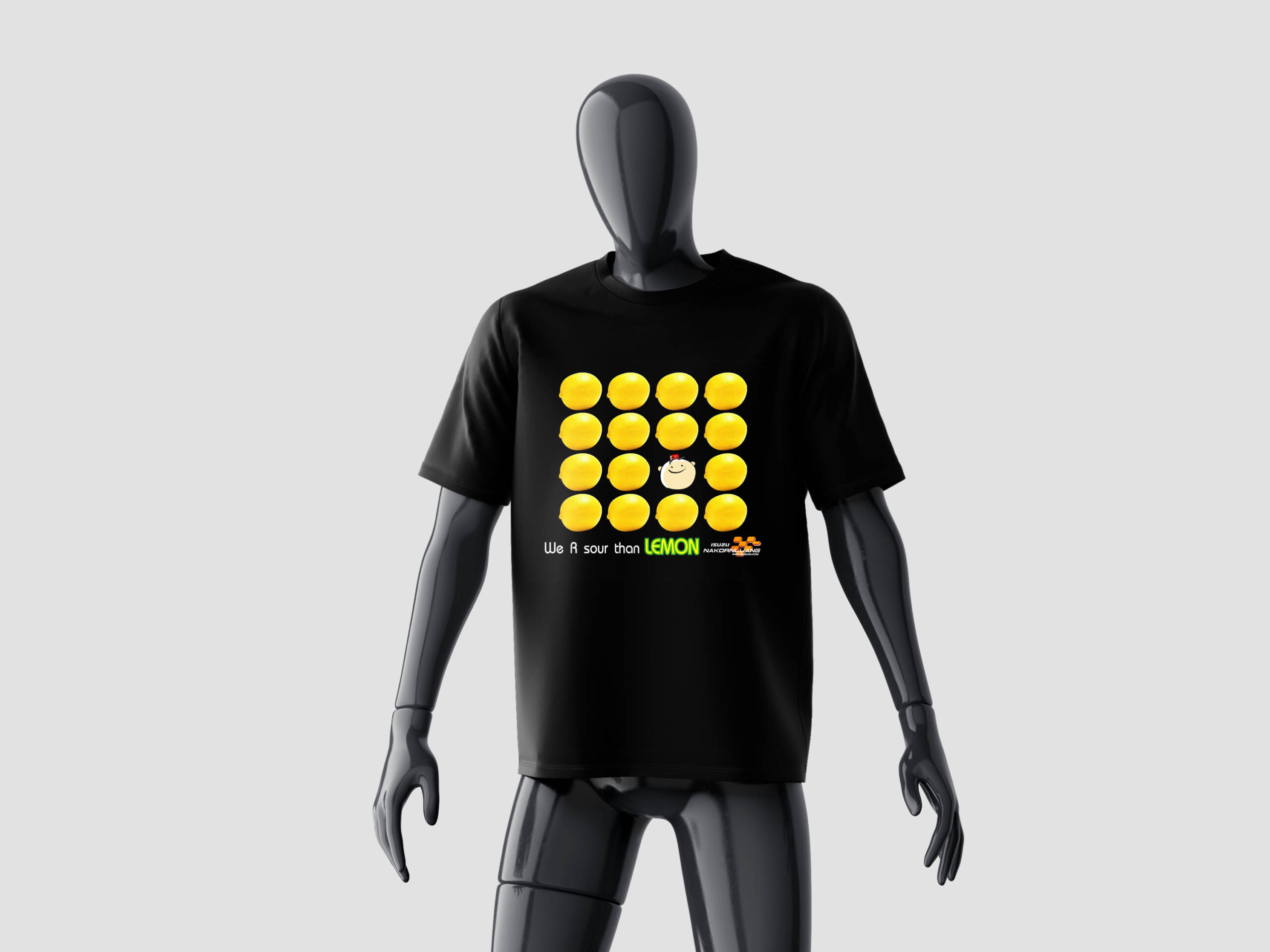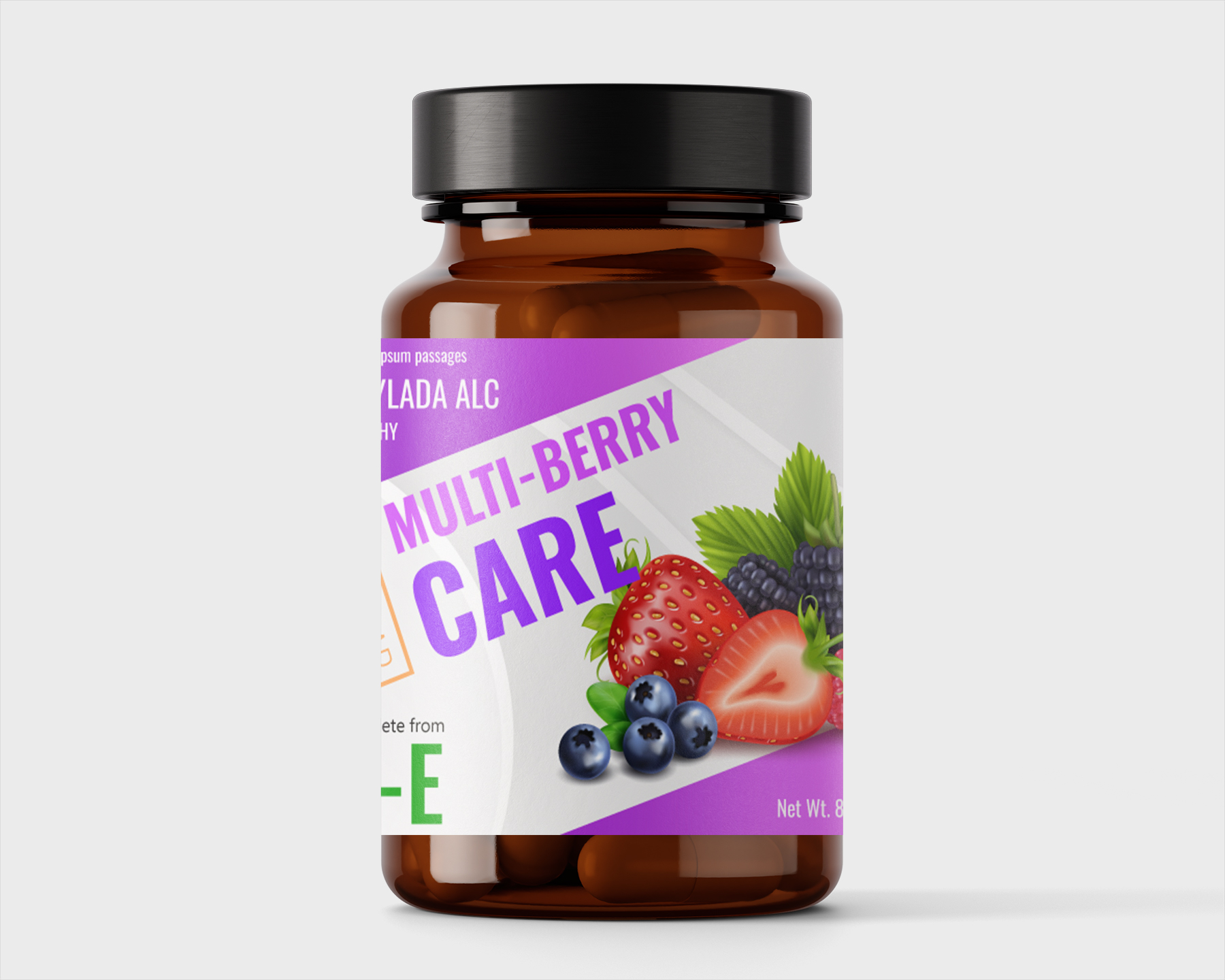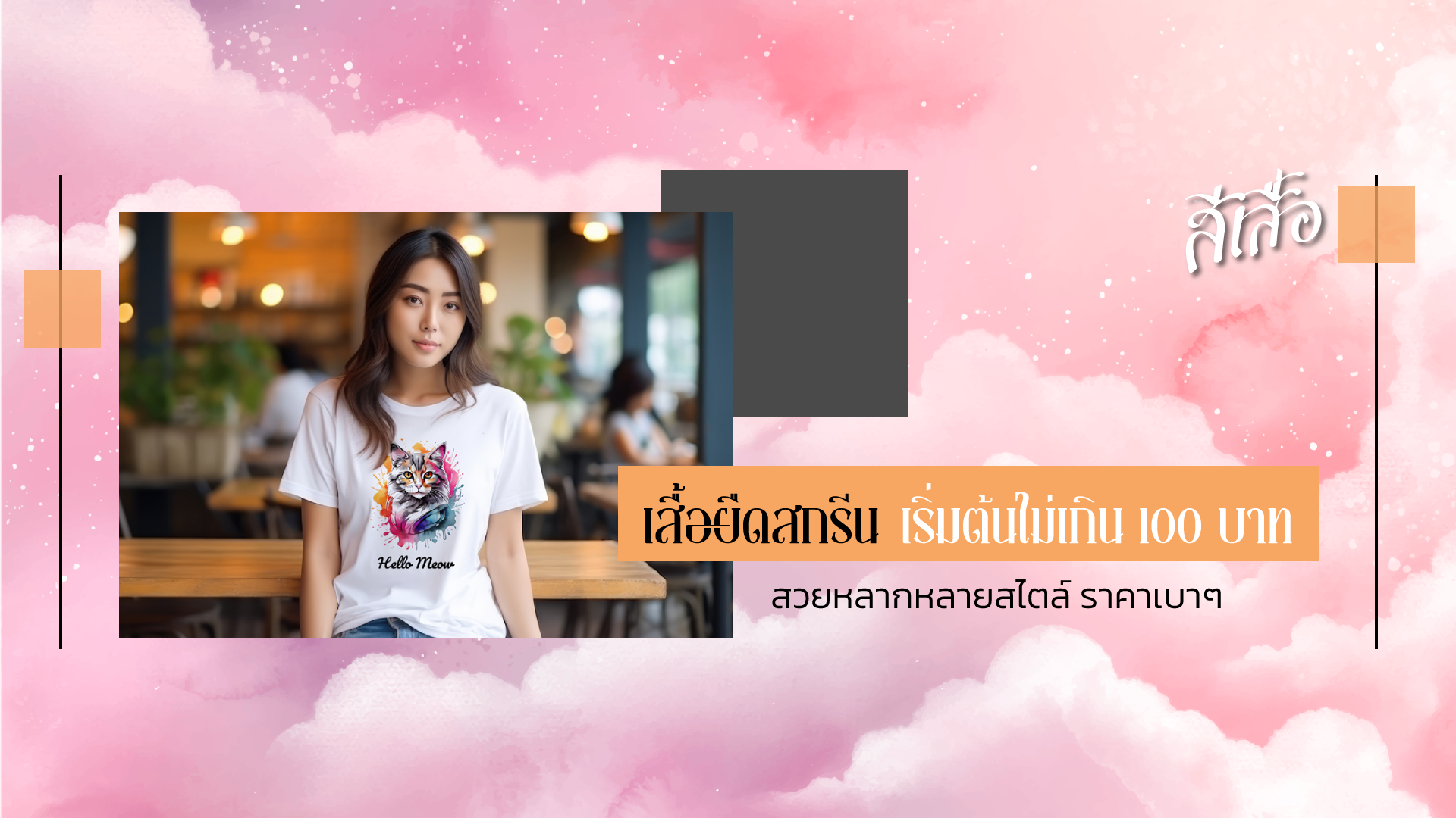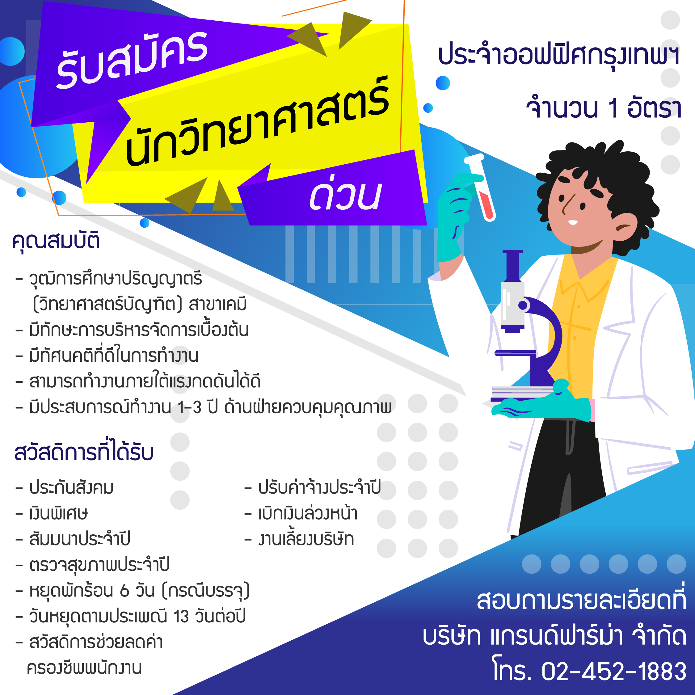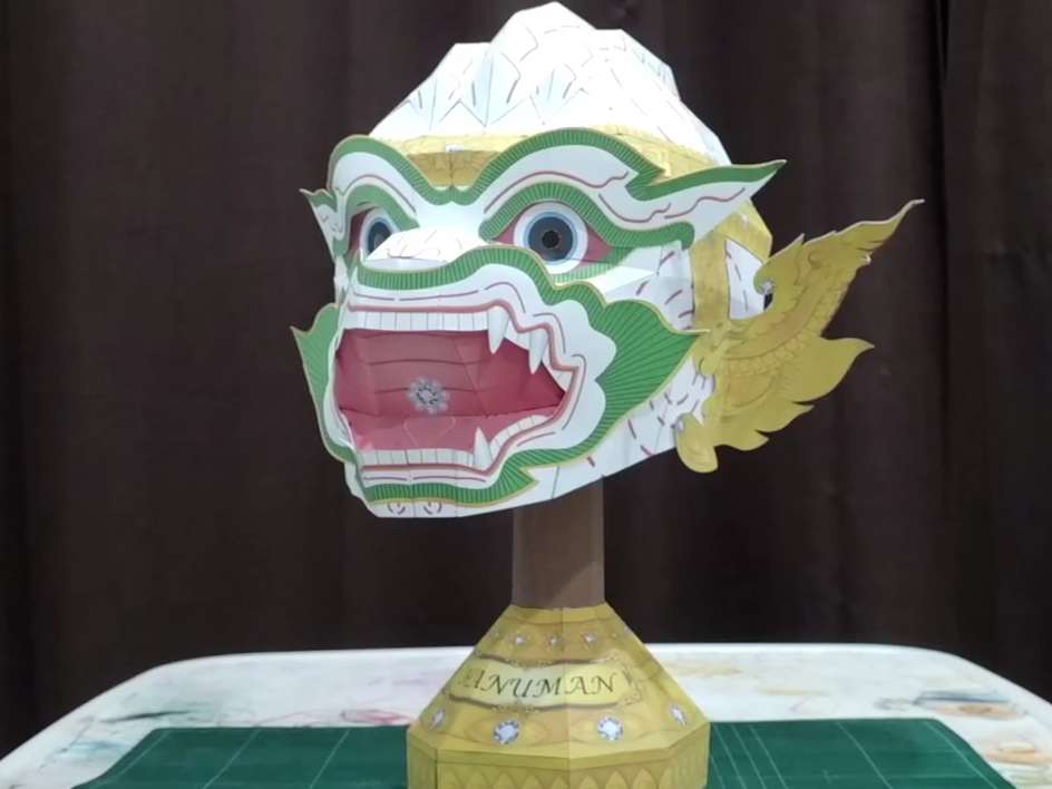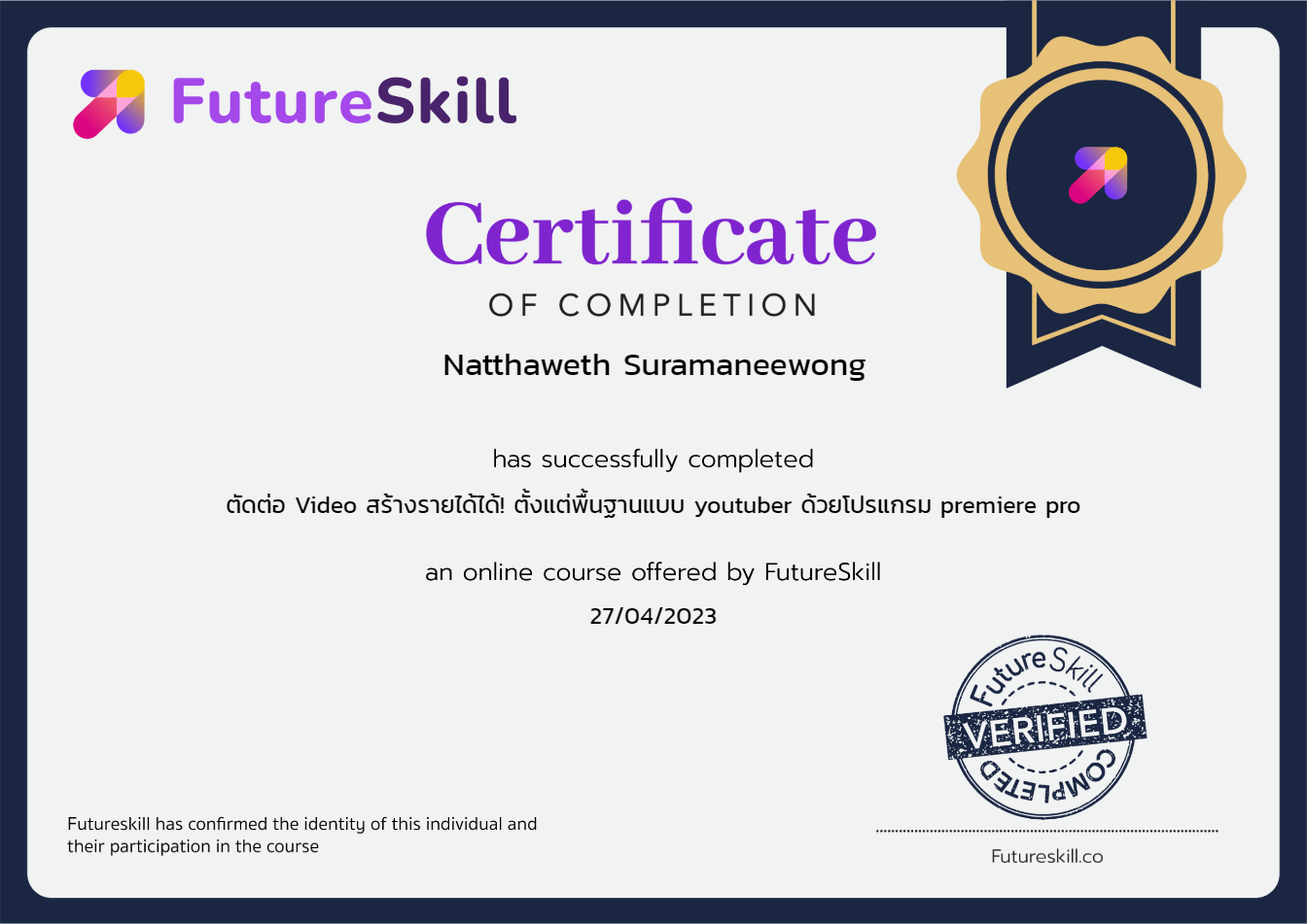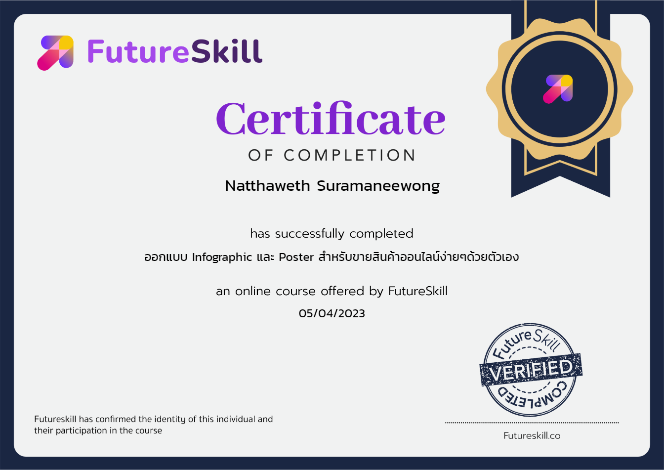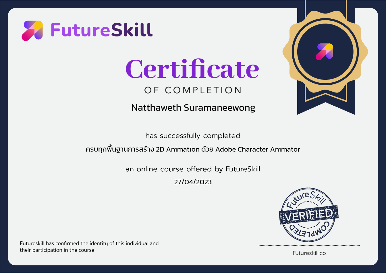

































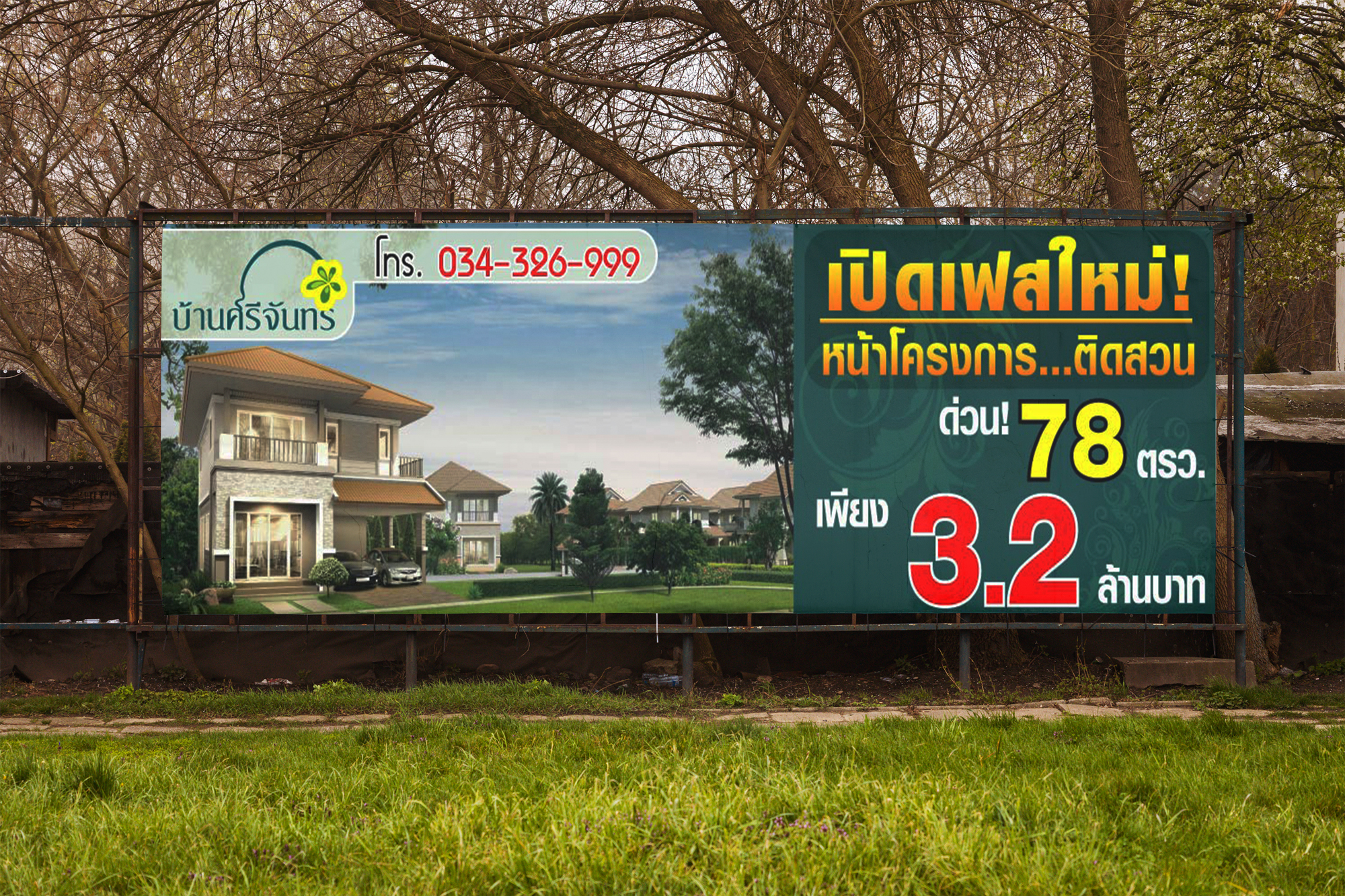
Print media design across various formats.
Infographic for socialmedia and website
Set artistic direction and maintain brand consistency, with expertise in 2D & 3D design, video editing, and motion graphics.
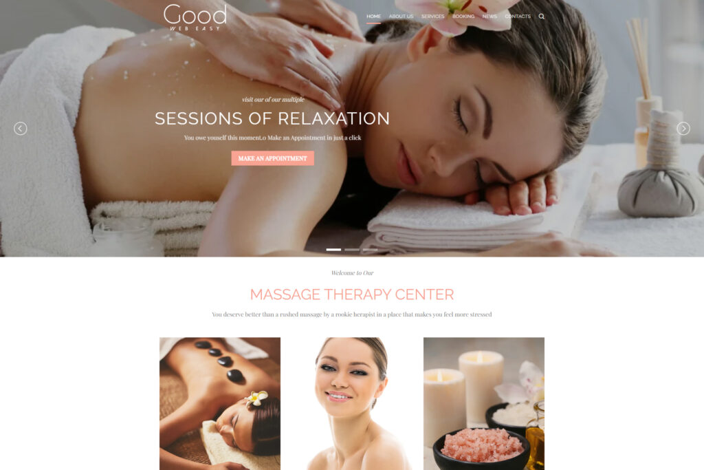
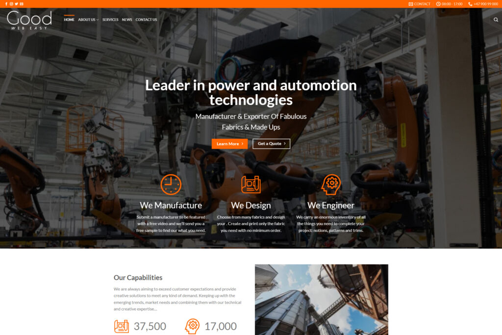
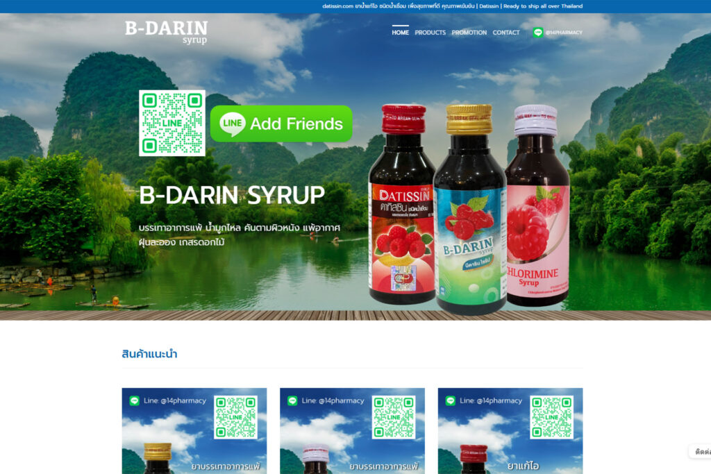
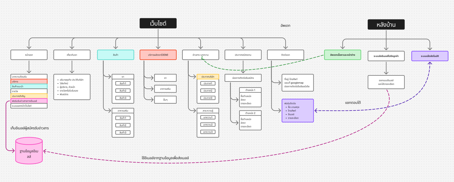
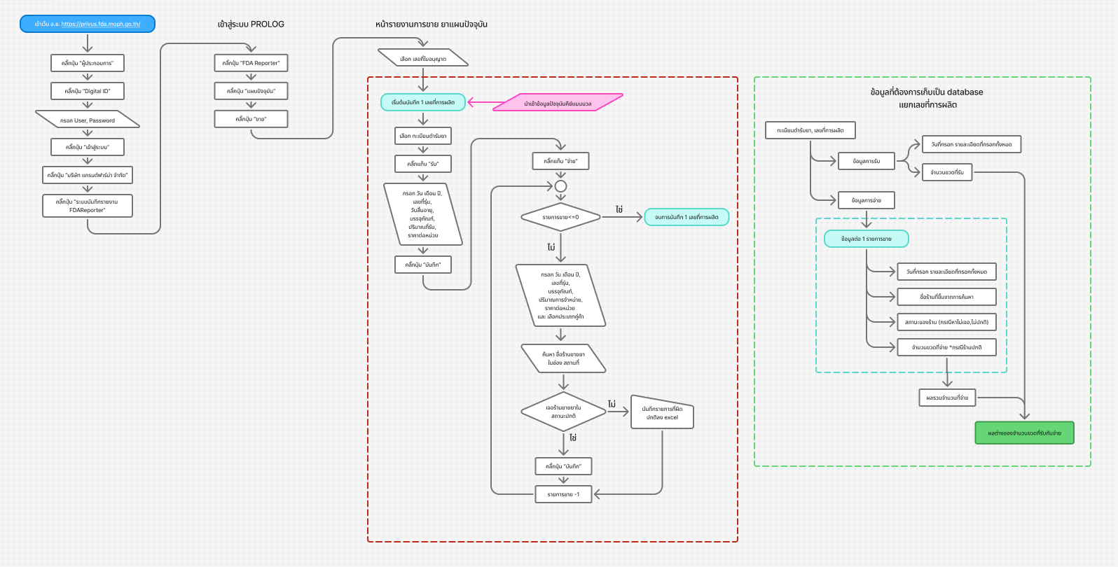
Develop websites and back-end systems, with UI/UX design in Figma.
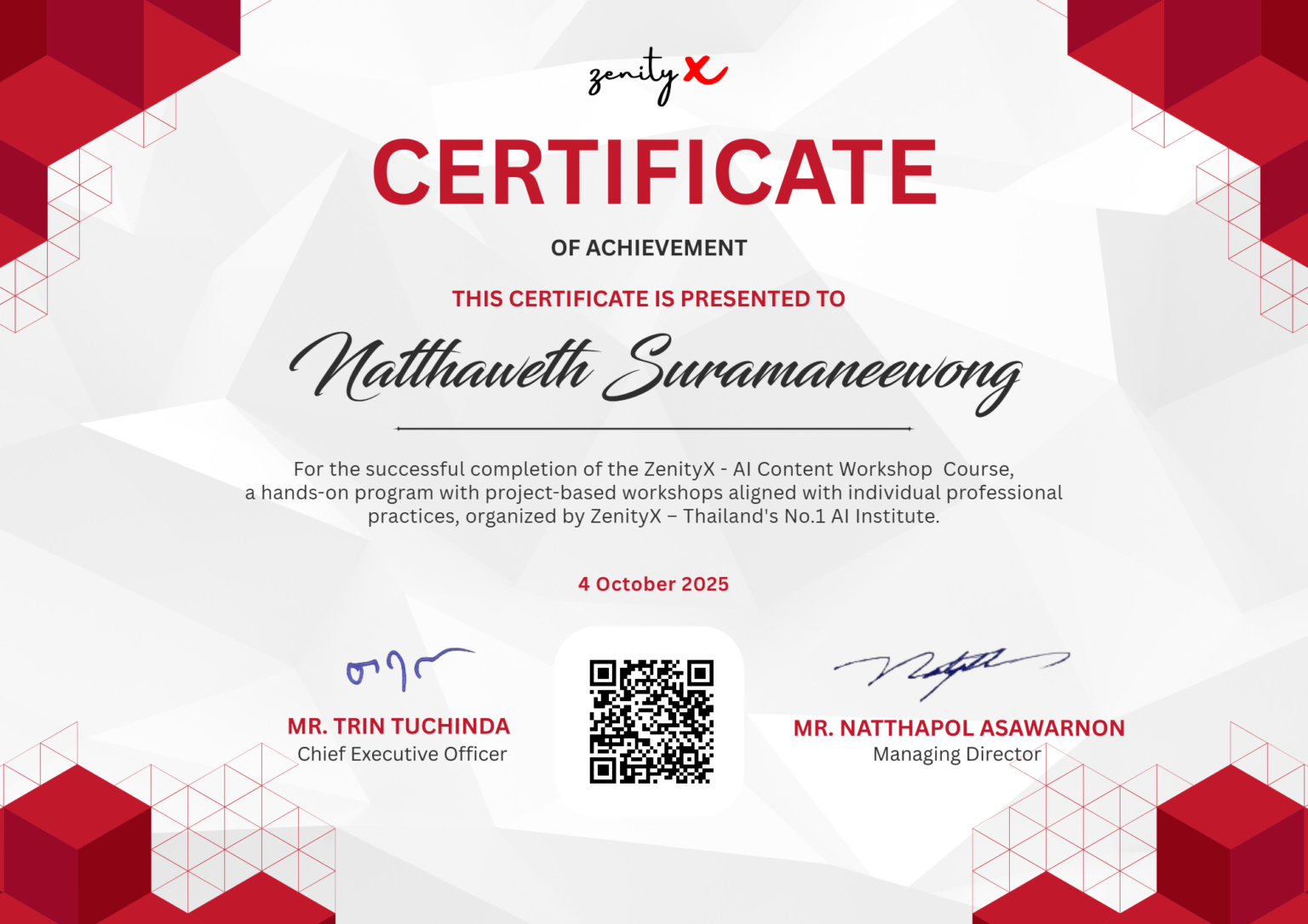
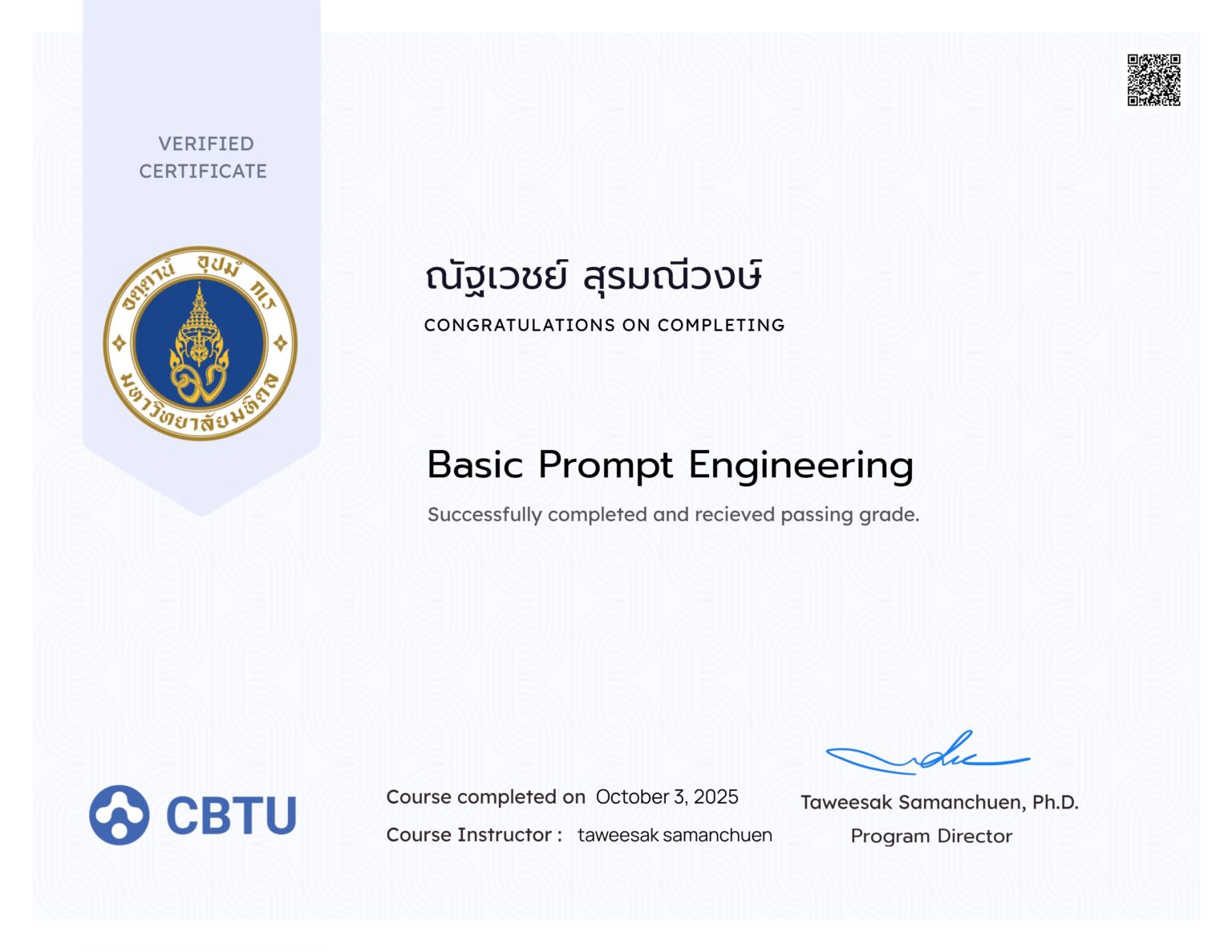
Enhance creative workflows using Generative AI for concept art, storyboards, and advertising visuals.
Good design starts with decisions, not just aesthetics.
these 4 cases don’t repeat the same point, but cover completely different design scenarios, from rethinking from scratch to working under unchangeable rules.
| Case | Skill | Highlights |
|
|
Visual Storytelling / Cross-Media Direction |
Built a visual narrative framework (Dual-World Contrast) and maintained the same visual DNA across media, including Key Visual, Motion, and Web. |
|
|
Concept-Driven Decision Making |
Developed concepts from scratch, backed by solid rationale for every design decision. |
|
|
Visual System Design |
Took existing brand identity from a real client and expanded it to ensure consistency across formats. |
|
|
Information Hierarchy |
Structured legally mandated information to be both legible and visually appealing within highly limited spaces. |
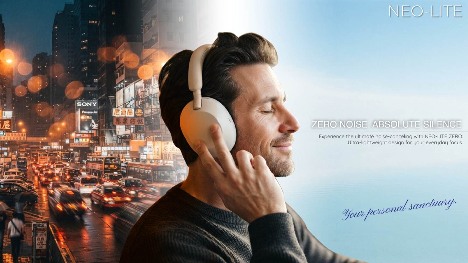
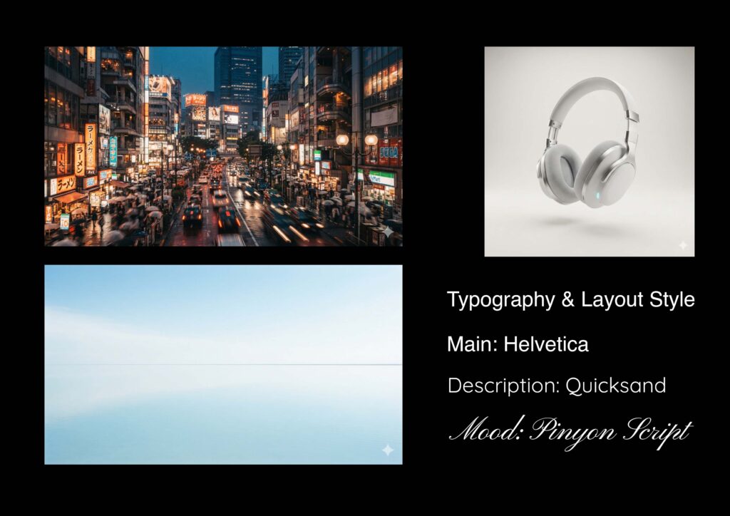
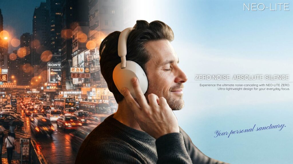
Case Study1: NEO-LITE ZERO
Built a visual narrative framework (Dual-World Contrast) and maintained the same visual DNA across media, including Key Visual, Motion, and Web.
Key Skill: Visual Storytelling, Cross-Media Direction, Concept Development, Typography
Crafting a Dual-World Visual Experience for Ultra Noise-Canceling Headphones
Concept Development Cross-Media Direction Typography Visual Storytelling
Step 1: Project Overview
Step 2: Big Idea & Visual Contrast
Step 3: Moodboard & Style Frames
Step 4: Production & Execution
Step 5: Key Takeaways & Impact
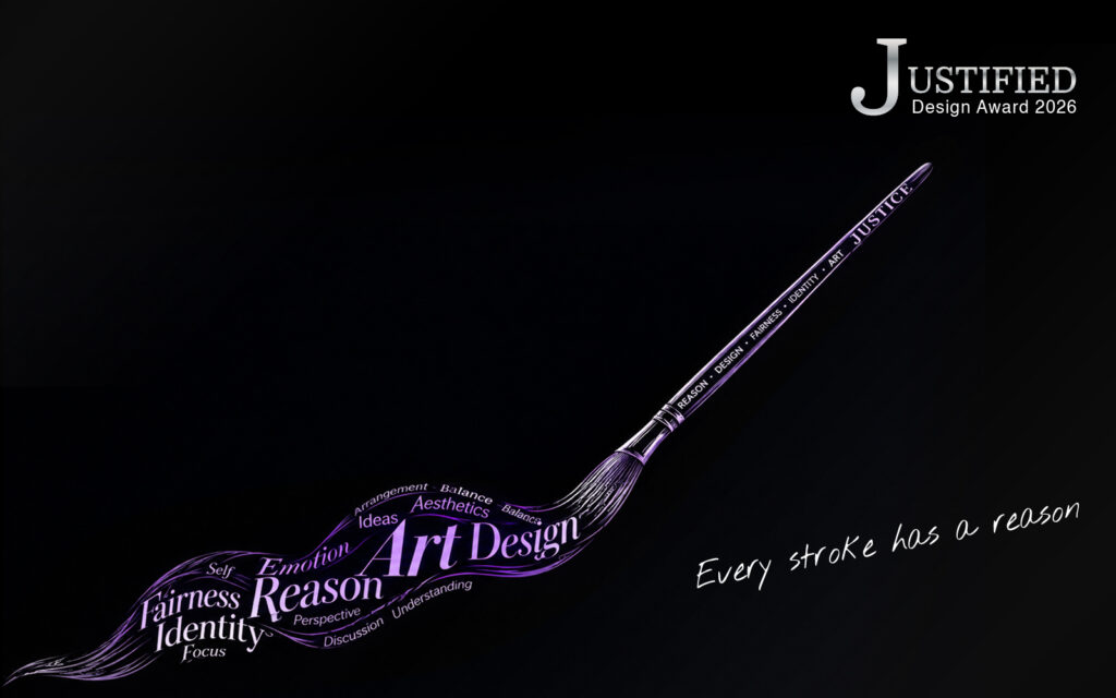
Case Study2: JUSTIFIED
Developed concepts from scratch, backed by solid rationale for every design decision.This includes the decision to remove elements after weighing operational limitations against the benefits.
Key Skill: Creative Decision Making, Visual System Design, Brand Indentity, Typography
A Visual Identity Built Around the Idea That Every Design Decision Has a Reason
Creative Decision-Making Visual System Design Brand Identity Typography
Step 1: Project Overview
Step 2: Core Concept & Visual Direction
Concept Journey:
Step 3: Visual System & Key Visual
Key Visual
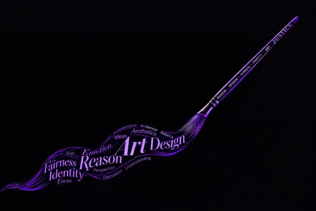
TYPOGRAPHIC BRUSH
Words representing the designer’s thought process are transformed into a brush-like form.
VISUAL GUIDELINE
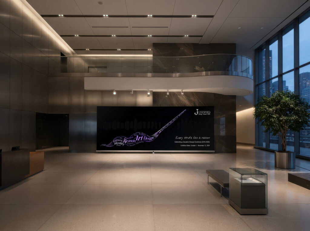
Visual guideline PDF downloadStep 4: Application & Execution
Step 5: Key Takeaways & Impact
Removing Metallic Texture
Metallic Exploration: Metallic treatments were explored during the initial design phase but proved to introduce more production limitations than practical value. As a result, they were removed from the core visual language, while Silver was retained as a color for highlights and premium accents.
Final Statement
Case Study3: Brand Consistency in Practice
Took existing brand identity from a real client and expanded it to ensure consistency across formats.
Key Skill: Visual System Design, Brand Indentity, Typography
Step 1: Overview & Role
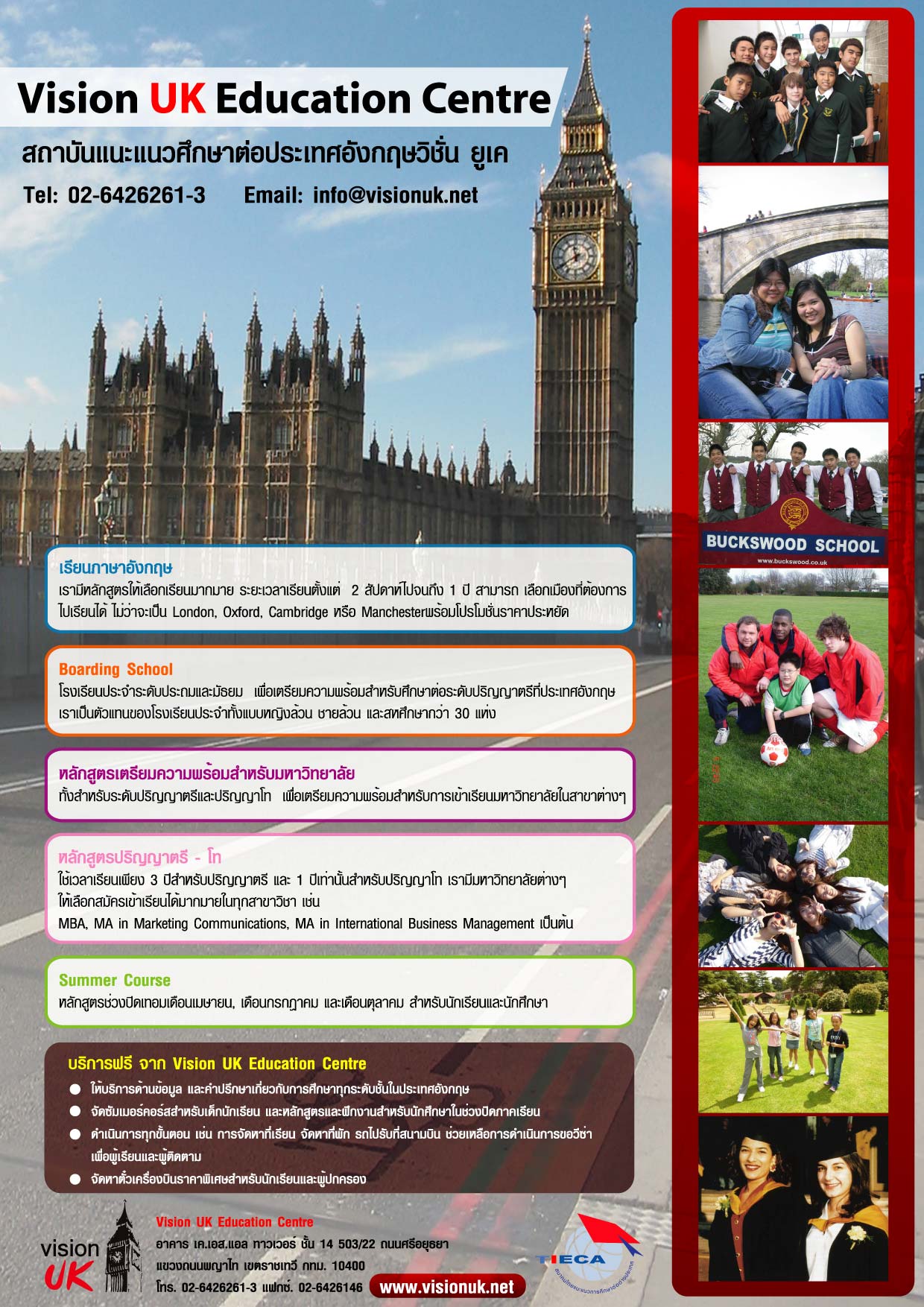
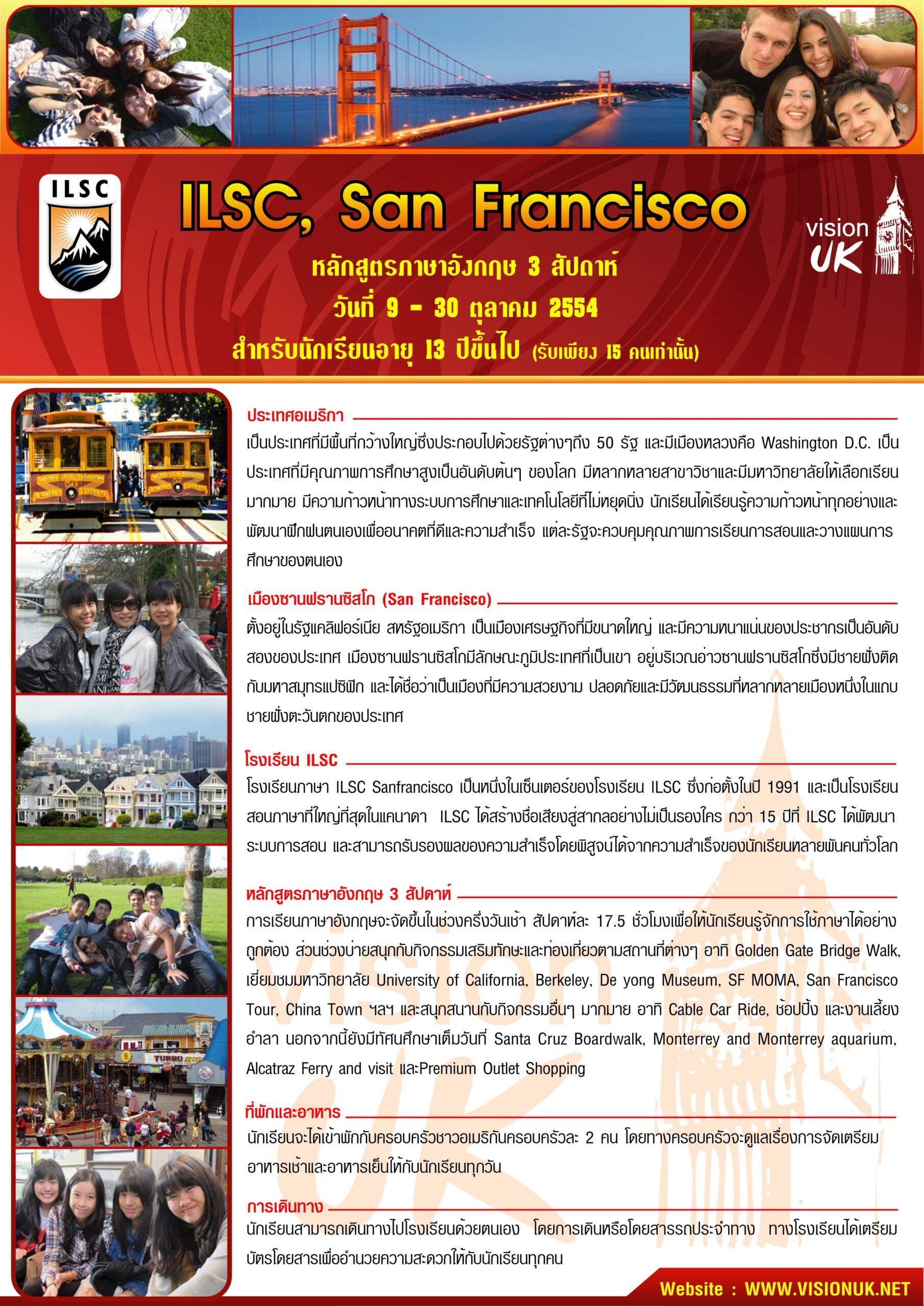
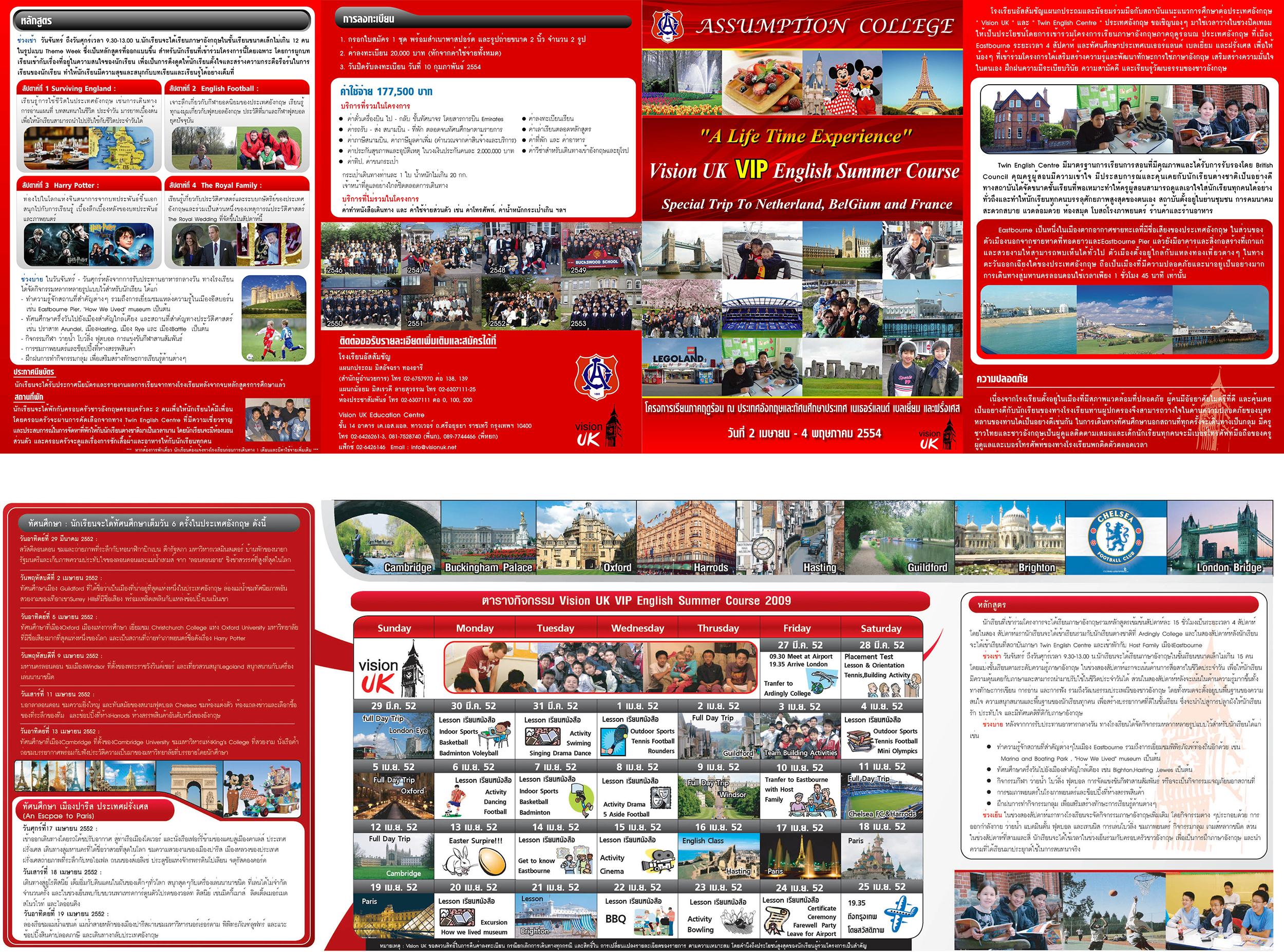
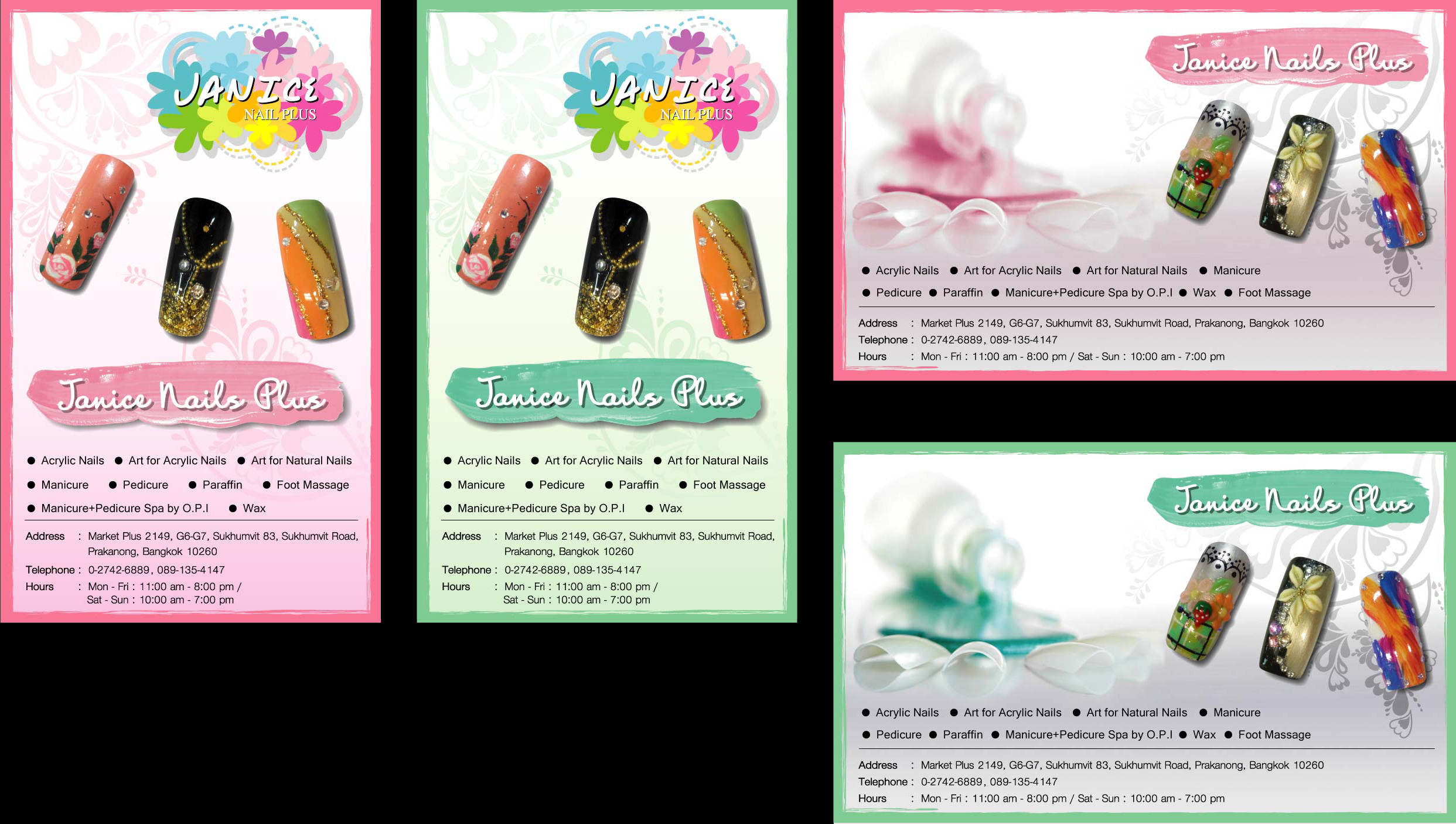
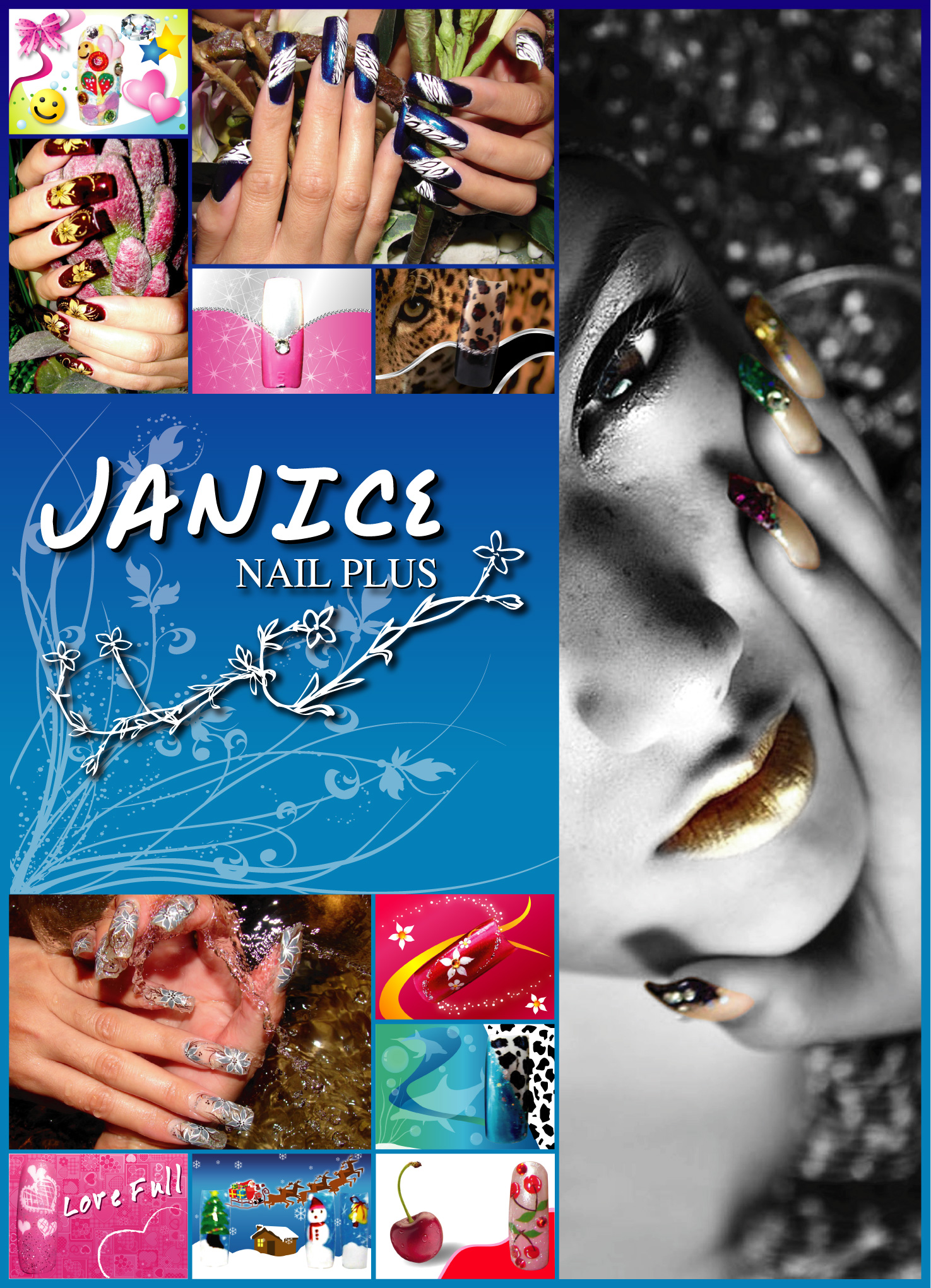
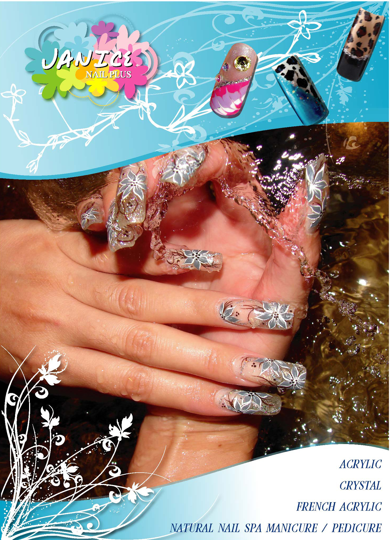
While working full-time at Isuzu Nakornluang and Toyota Nonthaburi, I took on additional design projects for three small-business clients: Vision UK Education Centre (education consultancy), Janice Nails Plus (nail salon), and O Zone Thai Restaurant (Thai restaurant overseas).
For each project, clients provided only basic information and supporting imagery, without a predefined visual direction. I was responsible for interpreting each brand’s identity from the available elements—such as logos and corporate colors—and translating them into a cohesive visual direction with consistent execution across multiple print media formats.
Role: Sole Designer — Brand Interpretation, Print Design, Visual Consistency
Step 2: Brief & Constraints
All three projects shared a common challenge: “Working within existing constraints rather than starting from a blank canvas.” This reflects a common real-world design environment, where creative direction must evolve from what already exists.
Step 3: Design Decisions
Each project involved intentional design decisions supported by clear rationale, while working within the constraints of an existing brand identity.
Vision UK
Janice Nails Plus
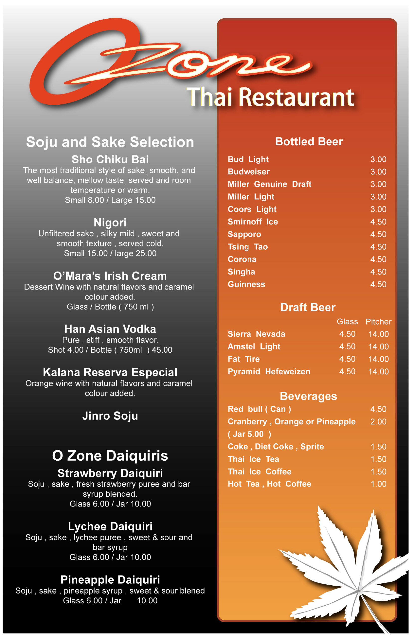
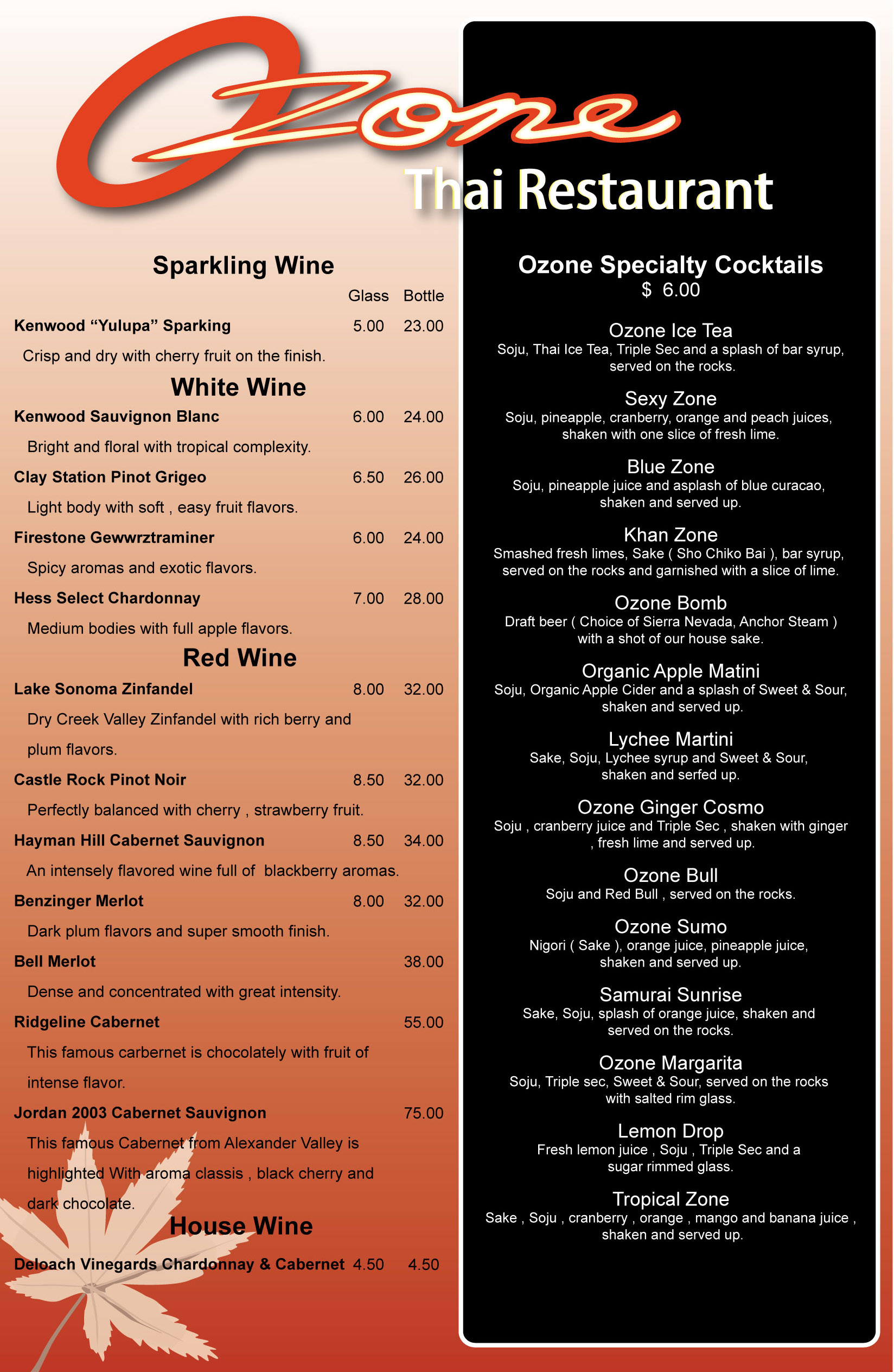
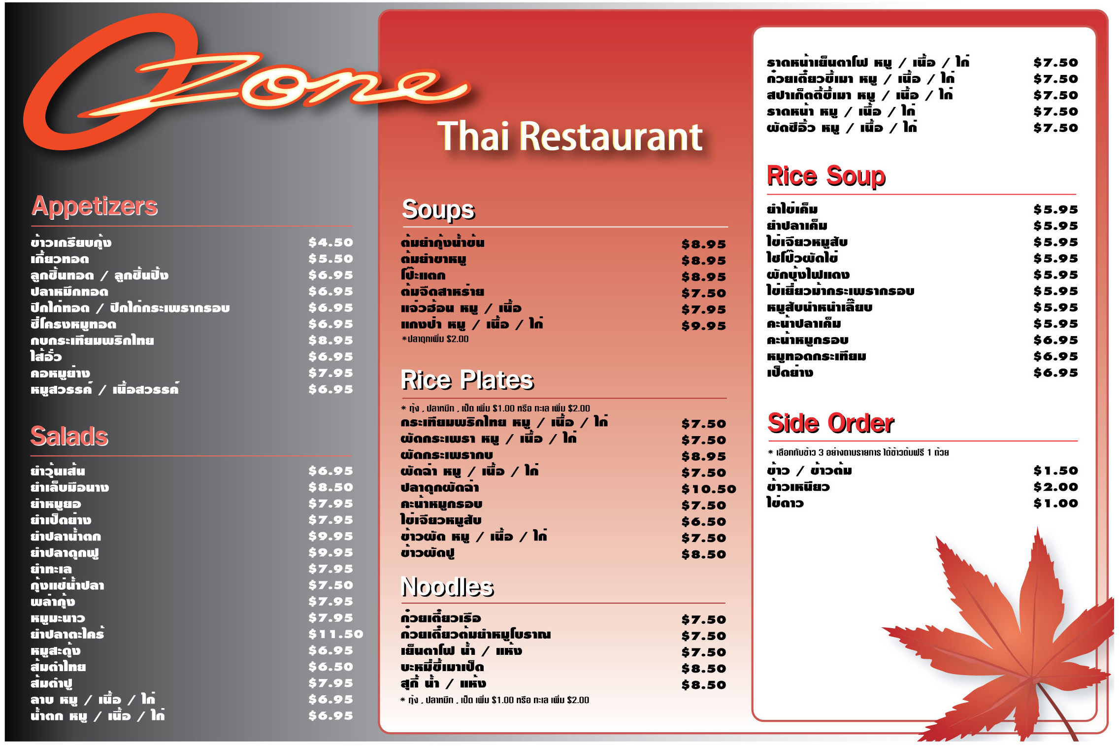
O Zone Thai Restaurant
Step 4: Applied Across Formats
Across all three projects, the work demonstrates the ability to maintain a cohesive visual direction across multiple media formats, while adapting the system to the specific needs of each brand.
Step 5: Key Takeaways
Case Study4: Design Within Regulation
Structured legally mandated information to be both legible and visually appealing within highly limited spaces.
Key Skill: Information Hierarchy, Typography, Visual System Design
Role: Sole Designer — Packaging Design, Regulatory Layout, Brand System
Step 1: Overview & Role
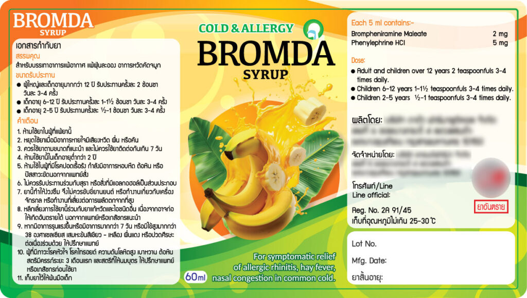
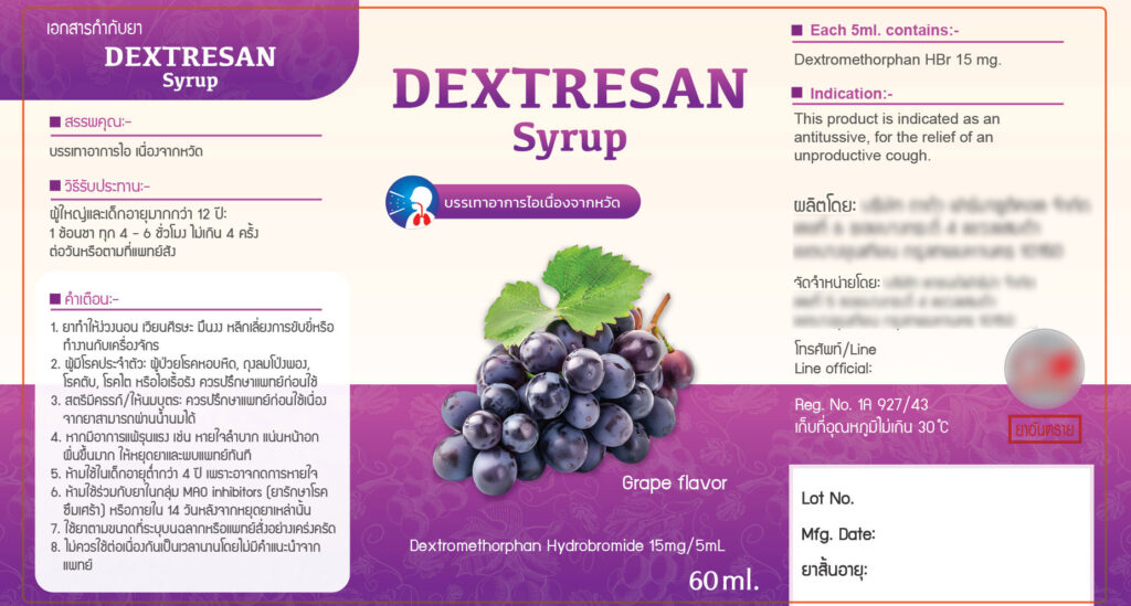
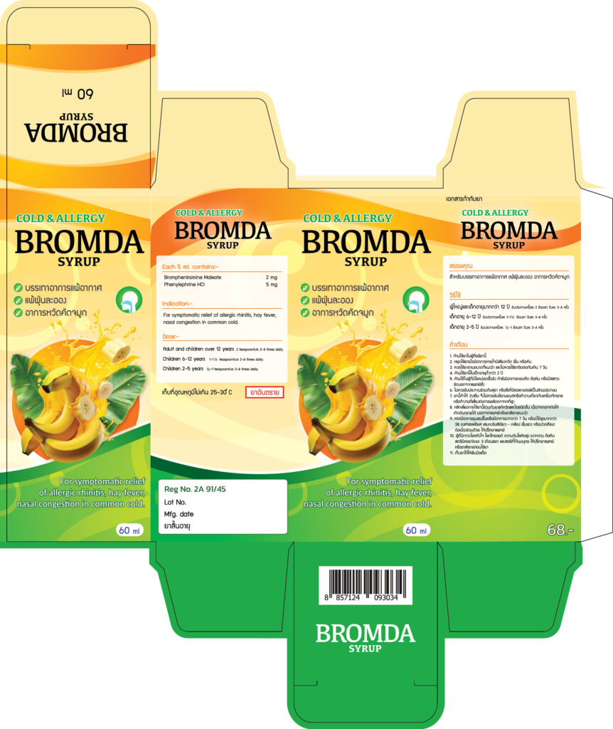
This is a current project at Grand Pharma, a pharmaceutical manufacturer and distributor of modern medicines. The brief involved designing the labels and packaging boxes for two syrup formulations:
The key challenge was to develop a visual identity that strictly complies with Thai FDA (อย.) requirements, while maintaining a distinctive visual character that is clear, engaging, and easy to read.
This project demonstrates the ability to balance regulatory requirements, information hierarchy, brand consistency, and visual appeal within a highly constrained packaging environment.
Step 2: Brief & Constraints
Unlike the three previous case studies, where the constraints were primarily defined by existing client brand identities, this project involved far more rigid constraints driven by regulatory requirements rather than personal preference.
Step 3: Design Decisions
Flavor-Linked Color Coding: Developed a color system linked to each product’s flavor and perceived symptom experience, rather than assigning colors arbitrarily.
BROMDA SYRUP — Allergy & Nasal Congestion: Uses orange-yellow tones, combined with banana and splashing orange juice imagery, to communicate freshness and a familiar, approachable flavor profile.
DEXTRESAN SYRUP — Cough Relief: Uses a deep purple palette with grape imagery to communicate the grape flavor and create a softer, more soothing visual character suited to a cough-relief product.
This system allows consumers to differentiate the two products through color at a glance, reducing the need to read the product information before recognizing which formulation they are looking at.
This structure allows users to locate the information they need quickly, whether it is a pharmacist checking dosage information or a consumer simply identifying the product.
Step 4: Applied Across Formats
Step 5: Key Takeaways
Print media design across various formats.
Infographic for socialmedia and website

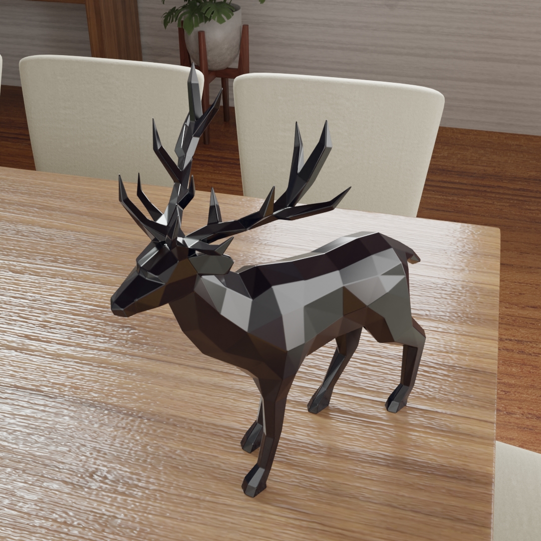
3D Product Renders
3D design and lighting composition to create realistic images.
Video editing, motion graphics, and music production, utilizing Generative AI to support the workflow.
Product Advertisement (AI)
Motion Graphic
Music (AI)
View another design:
https://drive.google.com/drive/folders/1BxcOhS_sLy-Tuew1Lei1lCy_LewMcAsk?usp=sharing
June 2025 – Present | Graphic Design
Grand Pharma Co., Ltd. (Pharmaceutical Manufacturer & Distributor)
August 2015 – March 2023 | Web Programmer
Sustainable Luxury Co., Ltd. (Six Senses Hotels & Resorts Group)
July 2011 – August 2015 | Web Developer & Graphic Designer
Toyota Nonthaburi Co., Ltd. (Automobile Dealership)
June 2007 – June 2011 | Web Developer & Junior Graphic Designer
Isuzu Nakornluang Co., Ltd. (Automobile Dealership)
Shaping visual direction and building distinctive brand identities through 19+ years of creative and Art Direction experience.